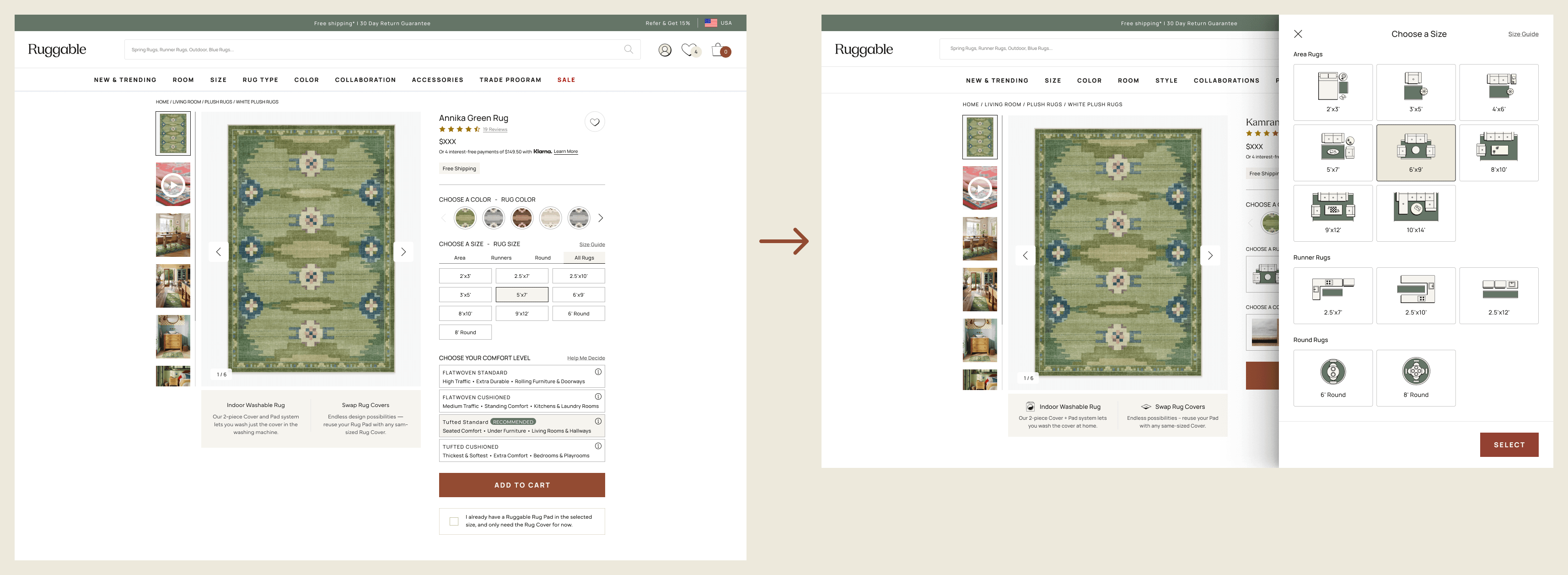
The Ruggable PDP was getting crowded above the fold: one size button plus four system
buttons, all competing for attention before customers had even started reading. We
hypothesized that moving size and system selection into a right-side drawer would reduce
the noise and open up real estate for richer guidance, images, and an embedded size
guide. The drawer won the desktop A/B test on Flatwoven and Tufted PDPs, then rolled out
across the rest of the catalog.
RolePrincipal UX Designer · Lead
CompanyRuggable
PlatformWeb · Mobile web
Status● Shipped · Aug 2024
+9%Desktop CVR (YoY, Flatwoven/Tufted)
+8%Desktop add-to-cart (YoY, Flatwoven/Tufted)
5+Rug types covered post-rollout
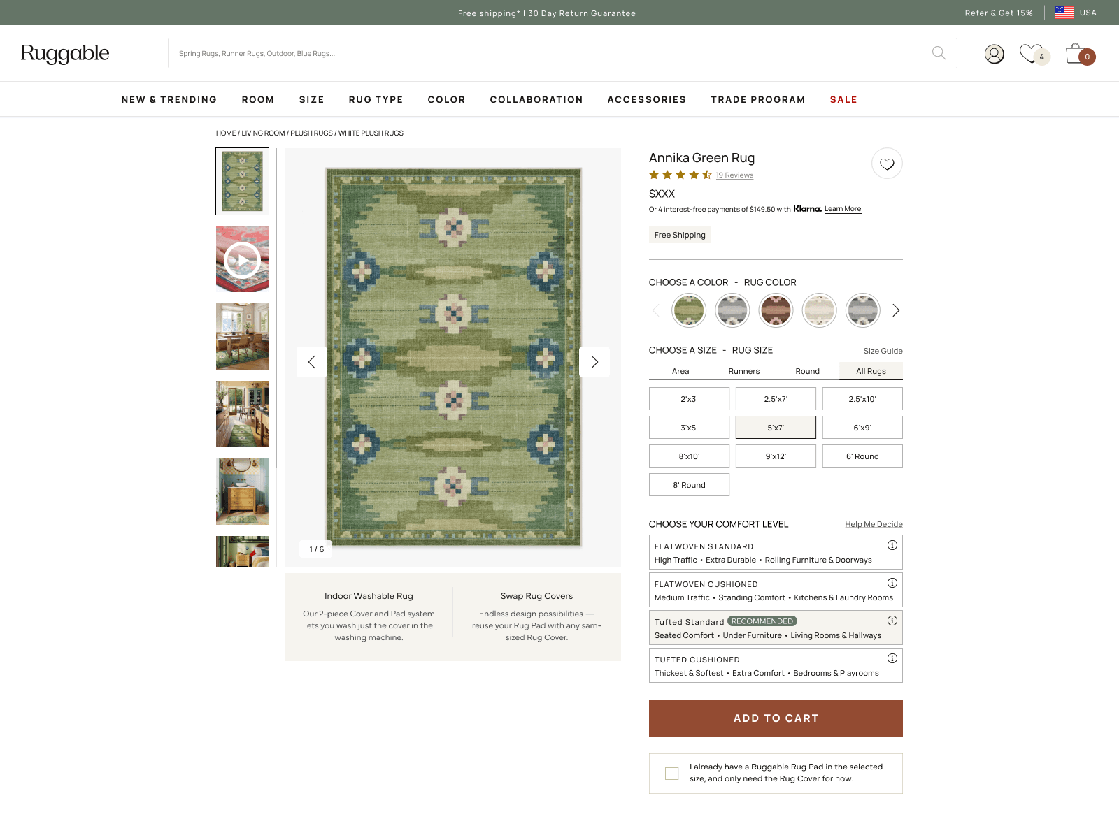
01 · The problem
Too much choice, too high up.
On the existing PDP, the customer hit five decisions before they'd really started
shopping. Above the fold: one size button (a dropdown of dimensions) plus four system
buttons (the rug-pad combinations Ruggable sells). All five sat inline, all five had
equal weight, and all five had to be parsed before scrolling.
The PM team had a hypothesis sitting in the backlog: by reducing the visible options
above the fold (one size button, one system button) and giving the rest of the
decision room to breathe in a side drawer, we could lift add-to-cart and conversion.
The drawer would also let us add what the inline pattern couldn't fit: images,
room-context guidance, and a real size guide.
Five inline decisions stacked above the fold. Visually correct, cognitively heavy.02 · The drawer
One size button. One system button.
The pattern was simple on the surface: replace the inline controls with a single Size
button and a single System button. Tapping either opens a right-anchored drawer with
the full options inside, plus the room to do what the inline pattern couldn't:
illustrate sizes with images, surface a Size Guide, and explain system differences in
plain language instead of system codes.
Same data, different envelope. The drawer kept the PDP quiet until the customer decided to engage with size or system.
Hypothesis
By reducing visible options above the fold (1 size + 1 system instead of 1 size + 4
systems) and aiding the choice through images and additional space inside the
drawer, we'd see a measurable lift in add-to-cart and conversion.
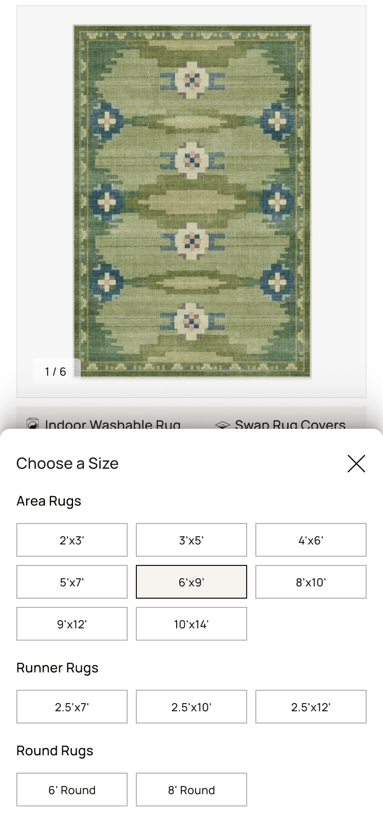
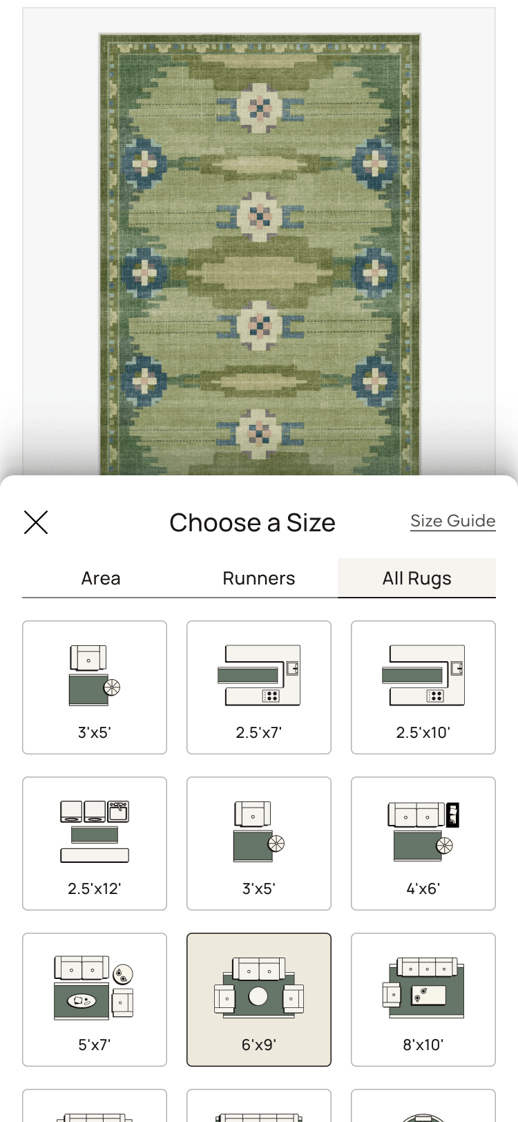
03 · Variants
Two ways to lay it out. Both tested.
We prototyped two versions of the drawer for both Size and System: a clean variant
showing options as labels and dimensions only, and an image variant pairing each
option with a visual. The PM team wanted clean evidence on which approach earned the
drawer real estate.
Size drawer
Variant A · Clean
Dimensions, listed.
No images. Each size as a tappable row with dimension and use-case label. Lower visual cost, faster to scan.
Variant B · Images
Each size, illustrated.
A visual paired with each option. More guidance for customers who couldn't translate dimensions on their own.
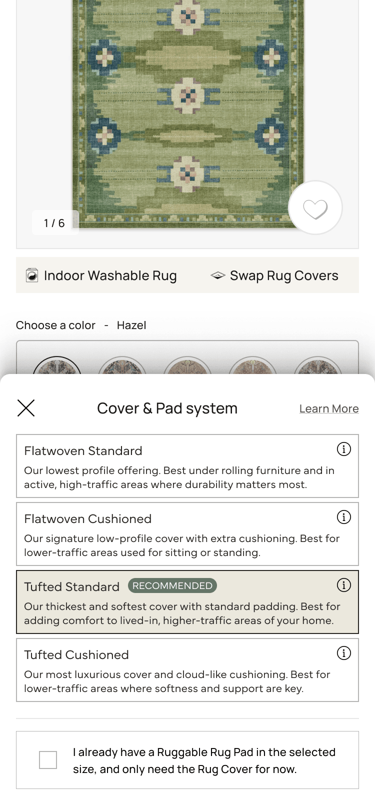
System drawer
Variant A · Clean
Same options, just collapsed.
Same four system options, surfaced from a single button. Removed inline clutter without changing the underlying choice.
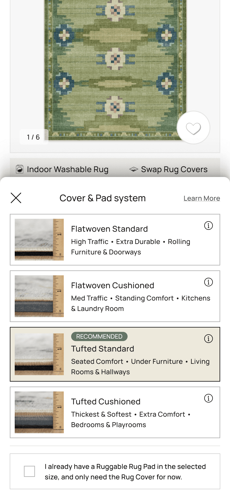
Variant B · Images
Each system, illustrated.
Visuals paired with each pad system to make the differences scannable at a glance.
User testing alongside the A/B
The A/B test would give us the lift. It wouldn't tell us why. To answer the "why" I set
up a usertesting.com study running in parallel, with three questions to answer:
Do users prefer the drawer layout over the current PDP design?
Does the extra space inside the drawer effectively showcase the chosen images and information?
Do the images inside the size and system drawers convey the intended message clearly?
What users said
Eight desktop sessions and eight mobile sessions. Themes were consistent enough
across both platforms to act on.
What the drawer earned
The size visuals carried the experience.
Across desktop and mobile, the praise was consistent: the illustrated size
variant, rugs shown with furniture at a scale you could compare at a glance.
The illustrated System variant landed the same way. Most customers had no
mental model for a "Cover Pad System," and the visuals filled the gap.
→ Both illustrated variants won. The clean variants scanned faster but lost on confidence.
What hurt
Size Guide wasn't a size guide.
Most users opened the "Size Guide" expecting help choosing a size for their
room, and found a unit conversion chart instead. One participant proposed the
honest rename on the spot: "Conversion Chart."
→ The fix came later: the room-tailored guidance moved up into the drawer, and
the conversion chart stayed on as a text link under the honest name.
What hurt
"Learn More" missed. People looked for an (i).
Users scanned the System drawer for a small info icon and skipped past the
"Learn More" text link. One participant singled out the (i) buttons on the pad
selectors as the most useful thing in the drawer, even though they were only on
one variant.
→ Logged for the next round: swap the Learn More text link for explicit (i)
icons on every option.
Logged for later
AR, color grid, pad comparison.
The wishlist was mostly future work: AR sizing in the drawer, color swatches in
a grid instead of a horizontal scroll, and a pad-comparison slider for customers
who couldn't tell flatwoven from tufted. The first wave proved the drawer earned
its space; the next would decide what goes inside it.
Methodology note
The usertesting.com widget overlapped the "Help Me Decide" button on the desktop
prototype, which meant several sessions missed the button entirely. Treat any
click data on that specific feature from this round as inconclusive; the mobile
sessions weren't affected.
04 · Test & result
A drawer earned its place. On desktop, first.
The drawer pattern shipped to A/B on Flatwoven and Tufted PDPs across desktop and
mobile web. Desktop carried the lift cleanly. Mobile was directionally similar but
didn't reach the team's stat-sig threshold within the test window. The call: ship the
drawer on desktop for F/T, leave mobile in test, and keep watching the data.
Headline result · post-rollout YoY
Flatwoven and Tufted PDPs delivered a 9% YoY lift in desktop conversion
rate and an 8% YoY lift in desktop add-to-cart after the
drawer shipped in August 2024. Those numbers held over the measurement window and
were the basis for rolling the pattern out to the rest of the catalog.
05 · Expansion
Same drawer, five more rug types.
With the drawer working on Flatwoven and Tufted desktop, the next ticket asked for the
Size Drawer to roll out across the rest of the catalog. Different rug types carry
different size availability (Faux Hide, for instance, was rolling out a new 4.5×6 in
its animal-hide-shaped silhouette), so each template needed its own desktop and
mobile design that respected the available sizes without forking the pattern. Pad System
selection stayed inline for this round; the drawer earned its place for size, not system.
Faux Hide
Plus new 4.5×6
Shag
Standard sizes
Plush
Standard sizes
Re-Jute
Standard sizes
Outdoor
Standard sizes
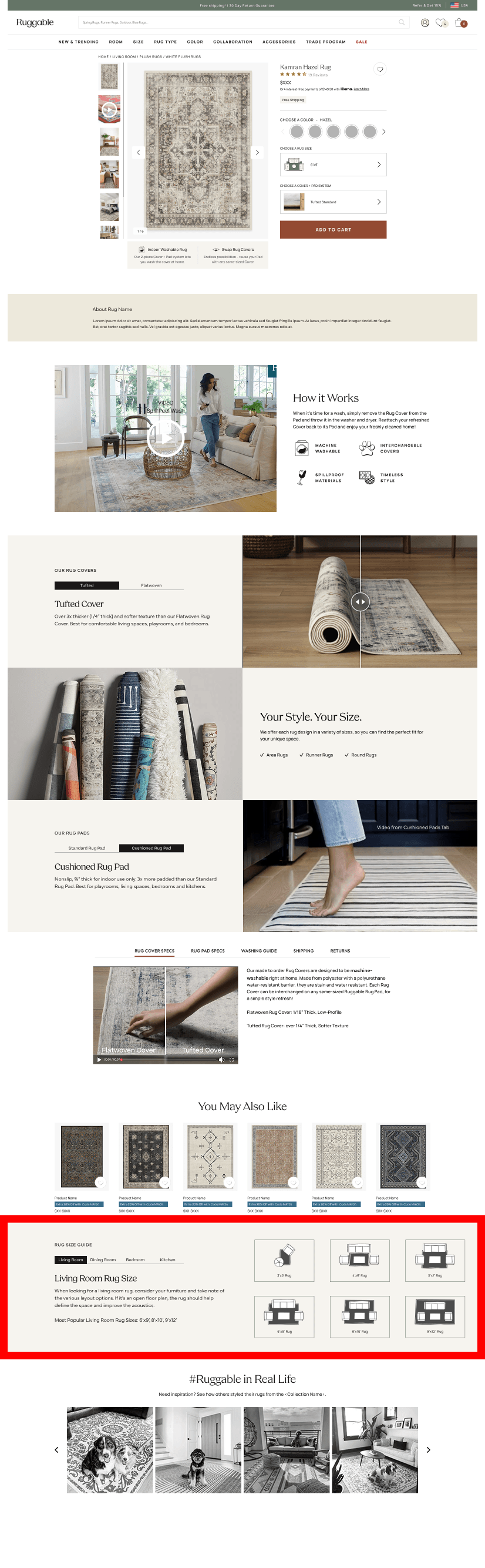
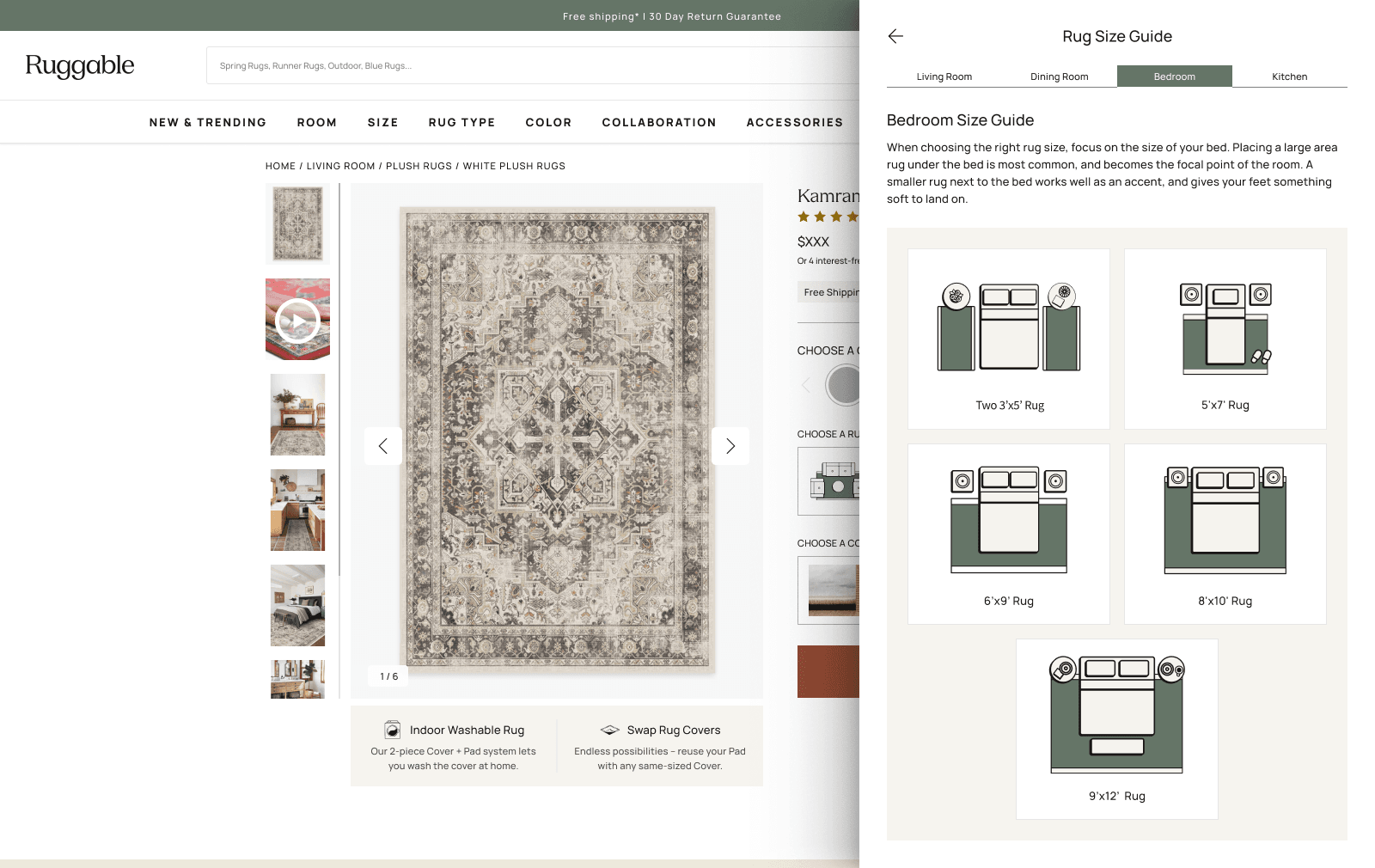
Room Size Guide, moved up.
A Room Size Guide already lived on the PDP, just farther down the page. Behavior
data showed customers scrolling specifically to reach it, which is the kind of
signal you can act on: people were doing the work to find context that mattered to
the size decision. The drawer had opened real estate at the exact moment that
decision was being made, so we moved the Size Guide there. Same content, surfaced
where customers needed it instead of where they had to go find it.
Before · Original PDP
After · PDP Drawer
From below the fold (left) to inside the drawer (right). Same content, surfaced where the size decision was actually being made.06 · Evolving the drawer
Once it earned the real estate, what to put in it.
With the drawer pattern shipped and expanding, the next test wave was about the
contents. PM and I scoped a series of moves to evolve how the drawer earned its space:
01
Recast the Size Guide.
Move from a static size chart to something more useful. Room-tailored images, Small/Medium/Large labels instead of Area/Runner/Round, and best-use-case context for each size.
02
A recommended-system upsell.
Surface a recommended pad system inside the Size Drawer so the customer doesn't have to bounce out and back to make a coordinated choice.
03
Show the current selection, always.
Pin the current price, size, and system at the top of both drawers so the customer knows exactly what they're modifying. Reduces the "wait, what did I pick again?" round-trip.
07 · Reflection
What the drawer taught us.
What worked
Reframing the problem from "picker" to "above-the-fold load."
The inline picker wasn't the problem. The above-the-fold cognitive load was. Once we framed it that way, the drawer was an obvious lever, and it freed us to put more (not fewer) helpful things inside it.
What I'd change
Lead the design from mobile.
Desktop won cleanly, but mobile is the bigger traffic share. Designing desktop-first meant the mobile drawer was a port, not a native pattern. Next time I'd start small-screen and let desktop borrow.
Open question
Drawer real estate is now contested.
Once the drawer earned its space, every team wanted in: size guide, recommended system, upsells, room imagery. Useful, but the drawer can't be all things. We need a content hierarchy for it before the inside gets as crowded as the inline picker used to be.
What's next
Mobile lift confirmation.
The desktop result is in. Mobile is still in test with a redesigned drawer informed by what we learned in the first round. When that result lands, the drawer pattern is fully validated across both surfaces.
Next case study
Ruggable · 2024 · AI
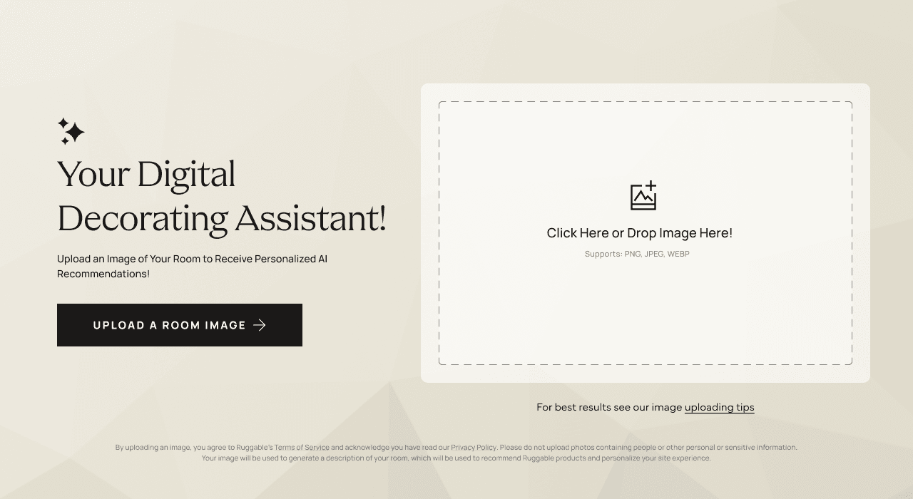
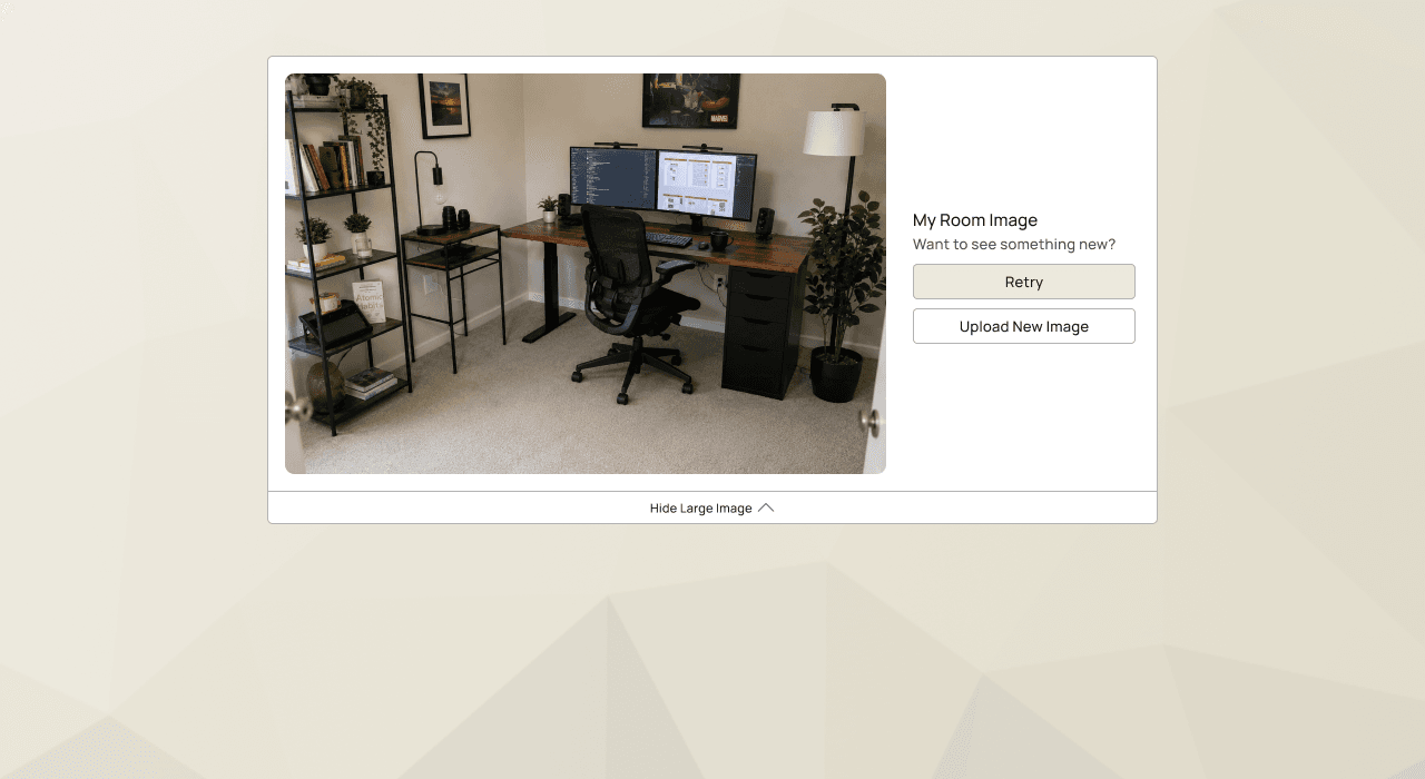
Designable. Started as a chatbot.
Ruggable's AI rug recommender. Started as a chatbot, then a form. Shipped as a single
photo upload that returns curated picks in seconds.