When I joined Ruggable, design lived in Sketch: one file per designer, no shared
source of truth. I made the case for Figma, the team adopted it fast, and from there
I led the build of an atomic design system. It launched alongside a full rebrand in
late 2021 and has matured through every rebrand since. Today it isn't just a designer
tool. With variants, toggles, and editable text properties on every component, the
content team builds and ships from it directly.
RolePrincipal UX Designer · Lead
CompanyRuggable
PlatformFigma
Status● Shipped · 2021, in continued use
Sketch→FigmaTool migration I led on joining
10–15minTo build a landing page, down from about an hour
LiveStill the shared product-design library
01 · The before
Scattered tools. No system to build on.
When I joined Ruggable in 2020, the UX team was two people: me and my manager. We
worked in Sketch, with no shared system underneath us. No source of truth for
components, no agreed structure, just files. At two people it was manageable, but
it was the wrong foundation for a team and a company about to grow.
Sketch was only part of it. The social team worked in Illustrator and Photoshop,
and charts and slides lived in another tool again. Nothing connected, so everything
got exported: files exported just to be reviewed, then exported again when they
changed. Version history was whatever the file names claimed, and a folder of
near-identical duplicates is not version history. The cost wasn't any single tool.
It was the seams between all of them.
My manager and I were both ready for something better, so the UX side of the move
was quick to agree on. The rest of the org would take longer.
02 · The Figma move
I made the case for Figma. The UX team moved fast.
With a two-person UX team, the move was simple to make. I showed my manager what
Figma could do: real-time collaboration, shared libraries, components that updated
everywhere at once. At the time the gap between Figma and Sketch for team-scale work
was wide, and the demo made the case on its own. The two of us were working in
Figma quickly.
The migration wasn't the hard part. It was the unlock. You can't run a living,
shared system in a tool built around individual files. Figma made the system
possible; it didn't make the system. That came next.
Where it landed
The UX team was the easy part. Social and content were on Illustrator, Photoshop,
and a separate tool for slides, and they took longer to come across. It wasn't a
mandate; the system had to prove itself first. Over the following years it did. By
the time I left, social, charts, and slides had all consolidated into Figma, and
nothing got exported anymore except assets that were production-ready.
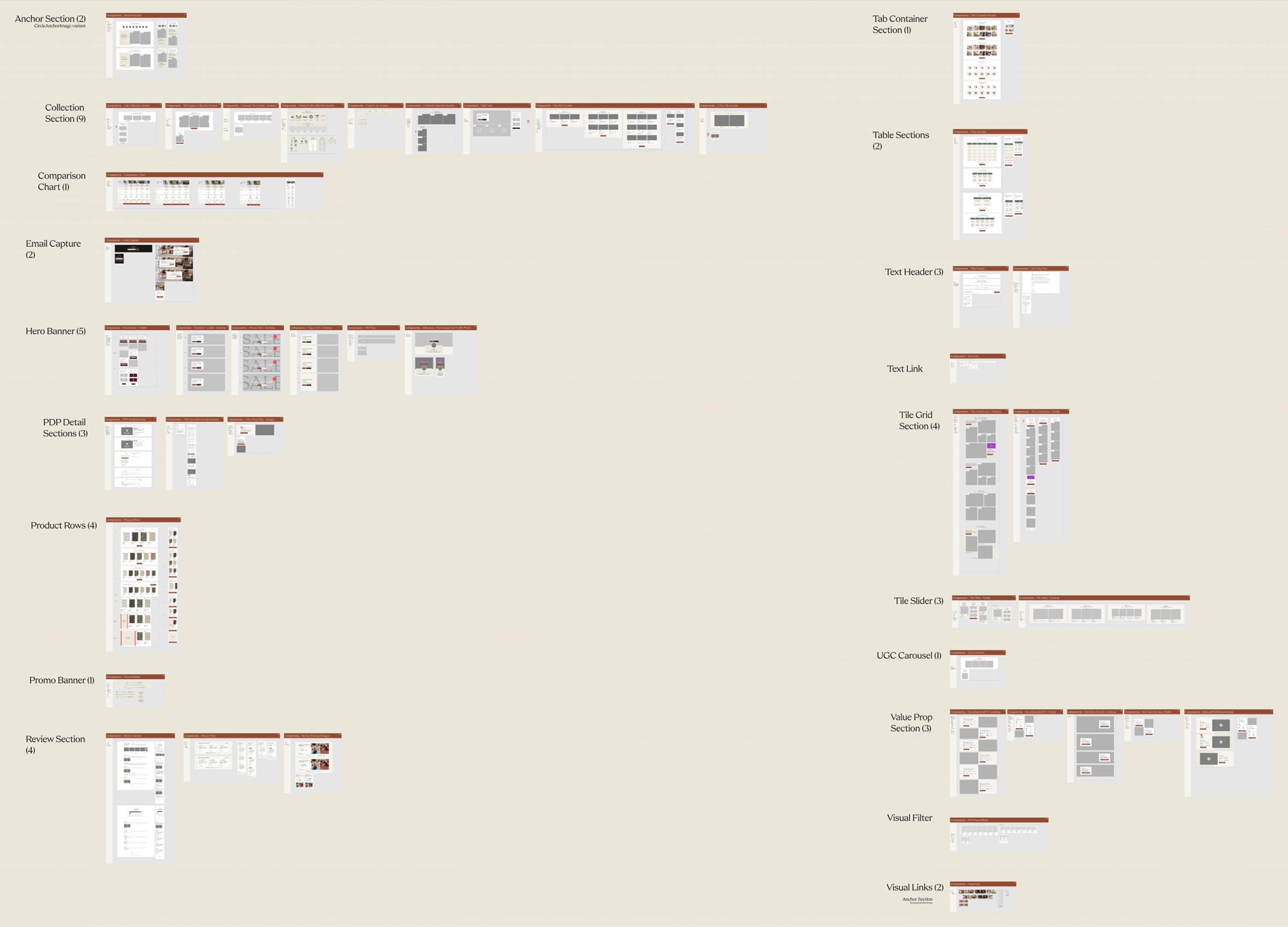
03 · The atomic system
Late 2021: build the system as the brand was rebuilt.
In late 2021 we pushed for a real shared design system, built on atomic
principles. I led the build and the naming, working to unify how the whole team
named and structured things so the library read the same to everyone.
Atoms up to pages
Atomic design builds the smallest things first and composes everything else from
them. Four tiers, each one assembled from the tier below.
Atoms
The basic building blocks: Color Styles, Text Styles, and components like a header, a button, a form field. The smallest pieces. On their own they don't do much.
Molecules
Atoms combined until they have a purpose. A form field plus a button becomes a search field: now clicking the button submits. Simple, portable, reusable, droppable anywhere search is needed.
Organisms
Complex components built from molecules, atoms, and other organisms. The nav is an organism, and a component in Figma: search, logo, dropdowns, and links working as one.
Templates & pages
Organisms are the bread and butter. Assemble them into a template, or a full page.
The timing was deliberate. Ruggable was about to go through a full rebrand, so
instead of retrofitting a system onto a finished brand, we built the system and
the rebrand together. Every new brand decision went into the library as it was
made. The rebrand became the system's first real test, and the system gave the
rebrand somewhere consistent to land.
Why it holds up
Nothing is a one-off. Change a Color Style and every component using it updates.
Change a component and every organism, template, and page built on it follows.
Through rebrand after rebrand, that cascade is what kept the system from turning
into a file-wide hunt.
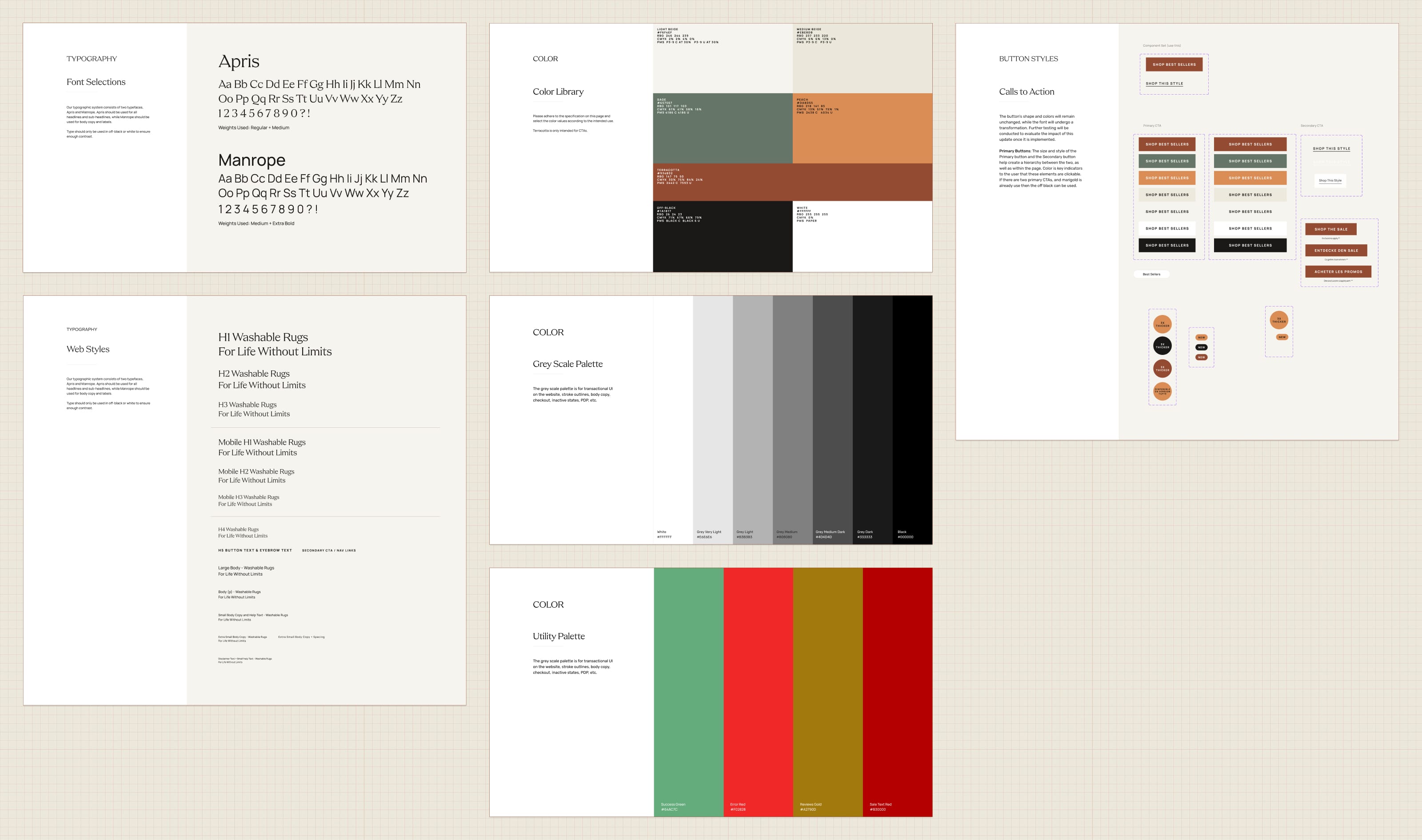
Color Styles, Text Styles, and button components. The shared base every page is built on.04 · Maturing it
Every rebrand, the system got sharper.
Ruggable didn't rebrand once. Over the years there were several, and each one was
a stress test. Each time, instead of breaking, the system absorbed the change and
came out better. Figma's own capabilities grew alongside it, and we adopted them
as they landed. What started as a flat component library became a system with
real depth.
◇
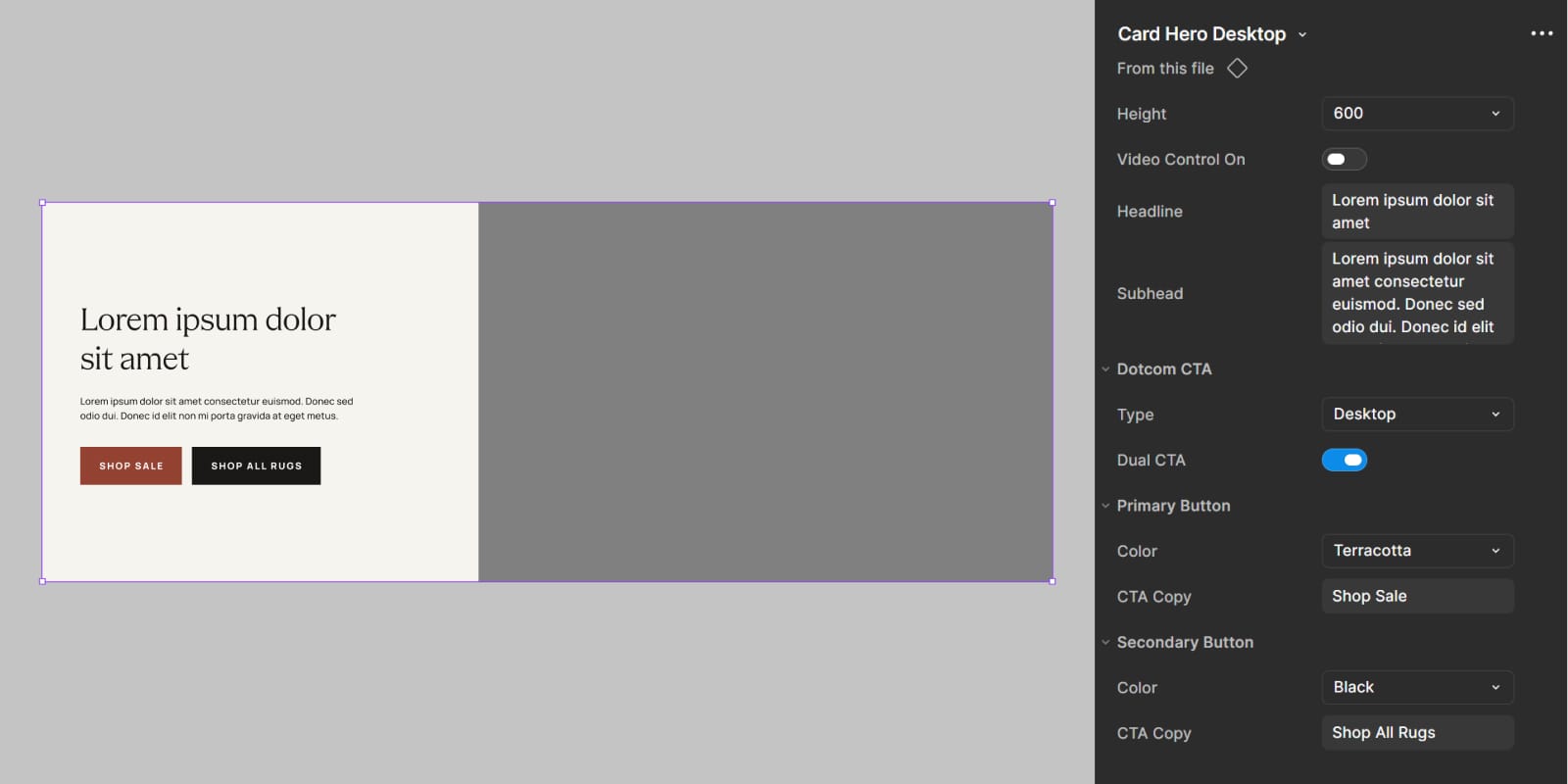
Variables
Scoped to each component, not a global collection. Variables connect a component's toggles and properties to what it shows, so one control drives the right change.
⧉
Variants
One component holds every state. Default, hover, selected, disabled, swapped from a single property instead of maintained as separate components.
◐
Boolean toggles
Show or hide elements inside a component without detaching it. An optional badge, a second line of copy, on or off from the properties panel.
T
Text properties
Copy editable straight from the properties panel, so changing what a component says never means digging into its layers.
None of these were features for their own sake. Each one removed a reason someone
would have to break the system to get their work done. The less the system asked
people to fight it, the more they used it as intended.
What it bought us
The efficiency gain was immediate and obvious. With the assets ready and a clear
plan for what we were assembling, a landing page that used to take about an hour
to build came together in 10 to 15 minutes. The system did the repetitive part,
so the team spent its time on the decisions that actually needed a designer.
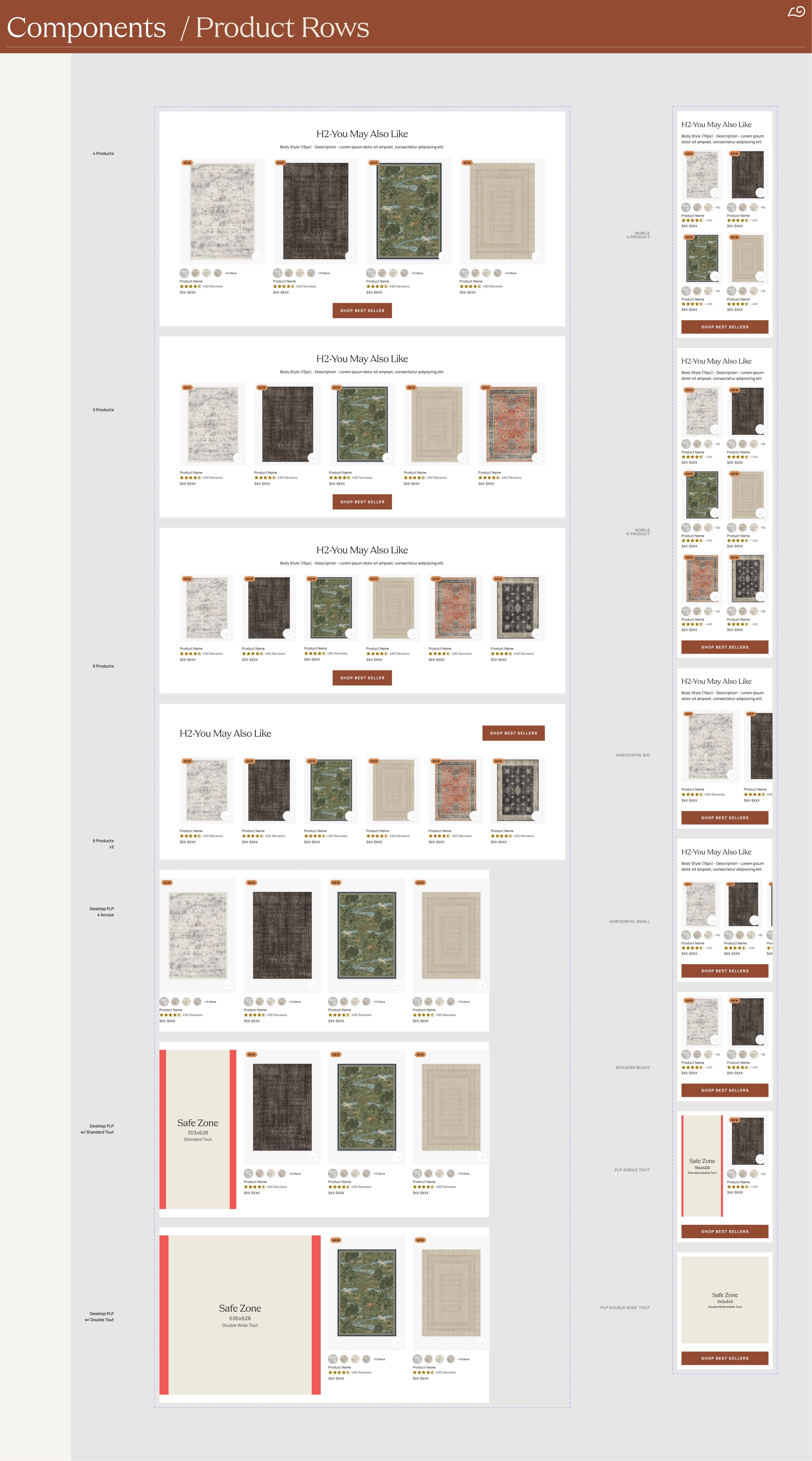
One component, every variant. The product row in its mobile and desktop states, each swapped from a single property.
Then we simplified it.
By 2025 the system had a new problem. It had grown more complex than the work
needed. The structure followed textbook atomic design to the letter: separate
pages for atoms, molecules, organisms, and templates. Correct in theory. In
practice, deciding whether a given thing was a molecule or an organism was
friction that earned us nothing, and the page structure was harder to navigate
than it should have been.
So we streamlined it to three: parts, components, and templates, with pages
folded into templates. The same atomic thinking, fewer arbitrary lines. The
simpler structure was easier to organize and manage, and it made cleaning up our
Figma pages straightforward. A system is only as useful as how fast someone can
find the right thing in it.
The 2025 cleanup
From Atoms · Molecules · Organisms · Templates to
Parts · Components · Templates. Same atomic principle, with the
category lines that caused more debate than they resolved taken out.
05 · Opening it up
First for design and dev. Then for everyone.
At first the system was built for the people who built the site: UX designers and
engineers. The components matched what dev needed, and the structure matched how
the UX team worked day to day.
The bigger move was opening it up. By exposing the right editable properties on
each component, toggles to show or hide elements, text properties to swap copy,
variables to change state, we made the system usable by the content team directly.
They didn't need to understand the structure underneath. They needed the few
things they would actually change, surfaced as properties they could edit without
breaking anything. That is when the system stopped being a design tool and became
a company tool.
UX Design
The first audience. One shared library replaced one Sketch file per designer. Consistent components, consistent naming, a single place the brand lived.
Dev
Components shaped to match how engineering built. Naming and structure aligned so handoff was a shared vocabulary, not a translation step.
Content
The audience that proved the point. Editable properties exposed on every component let the content team build and ship pages without touching design or dev.
What the content team works with. Toggles and text properties, editable without touching the structure underneath.
Mirrored in the CMS.
What made that actually work was Contentful. The system in Figma was almost
one-to-one with the CMS, around 99% parity. Every component in the library
existed in Contentful too, with the same variants, the same toggles, the same
text properties. We worked with engineering to get every option in, so a state a
designer could pick from in Figma was a state a content editor could pick from in
Contentful. Build a page in Figma, recreate it in Contentful, ship it. No dev work
in between.
Figma ↔ Contentful
99% parity between the design library and the CMS. The variants,
toggles, and text properties a designer used in Figma were the same ones a
content editor used in Contentful. The system wasn't just a place to design from.
It was a place to ship from.
The Brand LP Framework was one thing built on this foundation: a templated system
for brand collaboration landing pages that anyone could assemble in hours. The
design system is the layer underneath it, and underneath everything else the team
shipped.
06 · Reflection
What building the system taught me.
What worked
Build it during the change, not after.
Timing the system to a full rebrand meant there was nothing to retrofit. Every brand decision had a place to land the moment it was made. A system built into a moment of change absorbs that change instead of fighting it.
What worked
Match the library to the place work ships from.
The system was only as useful as the CMS underneath it. Getting Figma and Contentful to near one-to-one parity, with the same variants, toggles, and text properties on both sides, was what let content build and ship pages without dev. The lesson: design the system in the tool, but design it for where the work actually lands.
What I'd change
Open it to content sooner.
The designer-and-dev version came first, and the content-team version came years later. Some of that gap was Figma's features arriving over time, but some of it was just not seeing early enough that the system could serve content too. I'd ask "who else could use this" much sooner.
Open question
Who owns a system long-term?
A design system is never finished, but it isn't anyone's full-time job either. It lived because I kept pushing it forward alongside everything else. Whether a mature system needs a dedicated owner, or stays everyone's shared responsibility, is a question I never fully settled.
Next case study
Self-Initiated · 2025–26
Grounded. A net-worth tracker, designed and built solo.
A free, private net worth tracker. I designed it and built it with Claude as my
engineering partner. Every dollar a customer enters lives inside a Google Sheet in
their own Drive, not on a Grounded server.